Details
Fit: True to Size, Comfortable All Day
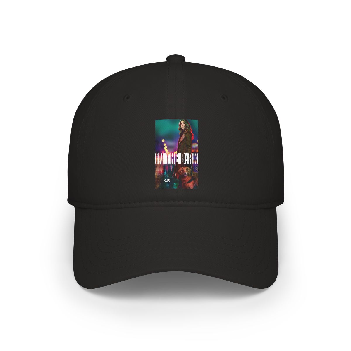
The first thing I noticed when I pulled the In the Dark Baseball Cap out of the package was how well it held its shape. It's a classic six-panel cap with a curved brim that doesn't feel stiff or flimsy. The adjustable strap on the back is generous - I've got a bigger head (think 7 3/8 fitted size), and it fit comfortably on the loosest setting without giving me a headache.
On the other end, my friend with a smaller head tried it on and cinched it down easily. This cap is one of those rare unisex designs that actually works across a range of sizes. The interior sweatband is soft and doesn't trap heat, which is huge when you're out in the August sun.
Style: Subtle Logo, Big Statement
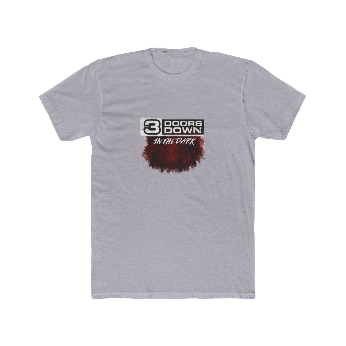
The front panel features the In the Dark logo in a clean, tonal embroidery that pops without screaming. It's the same aesthetic you see on the "OFFICIAL" Unisex Tee - that understated, slightly moody vibe that fits the brand's whole "in the dark" identity.
What I like most is how versatile it is. I've worn it with a plain white tee and shorts, and it's also worked with a little more of a streetwear feel when I paired it with the In the Dark Heavy Cotton Tee. The cap doesn't do the work for you - you bring the style, and the logo just ties it together.
Build Quality: Better Than Expected
For print-on-demand merch, I was prepared for the kind of hat that feels like an afterthought. That's not the case here. The embroidery is tight, no loose threads, and the stitching on the panels is even. The brim holds its curve after several wears, which tells me it's not going to flatten out after a season.
The fabric is a cotton-poly blend that feels sturdy but not rough. It's the kind of construction that makes the $35.99 price feel fair - not cheap, not overpriced, right in the middle of what you'd pay for a decent cap from any brand.
How It Compared to the Other In the Dark Cap
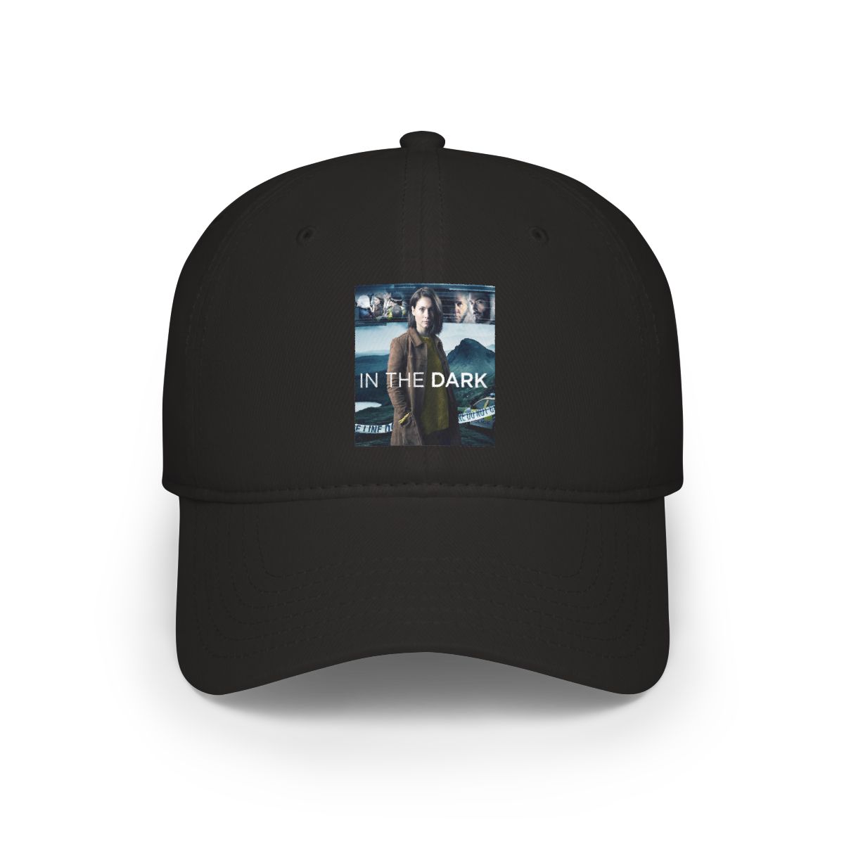
There's also the In the Dark Baseball Cap #3, which is the same price and same silhouette as far as I can tell. The main difference is the design - the #3 has a slightly larger graphic treatment on the front, while the classic cap keeps the logo smaller and more centered. If you're someone who prefers a more minimal look, the standard cap is the one. If you want a touch more attitude, the #3 is worth a look.
Both are solid, but the classic In the Dark Baseball Cap is the one I keep grabbing every morning.